
I think we need to start this post with something gorgeous.
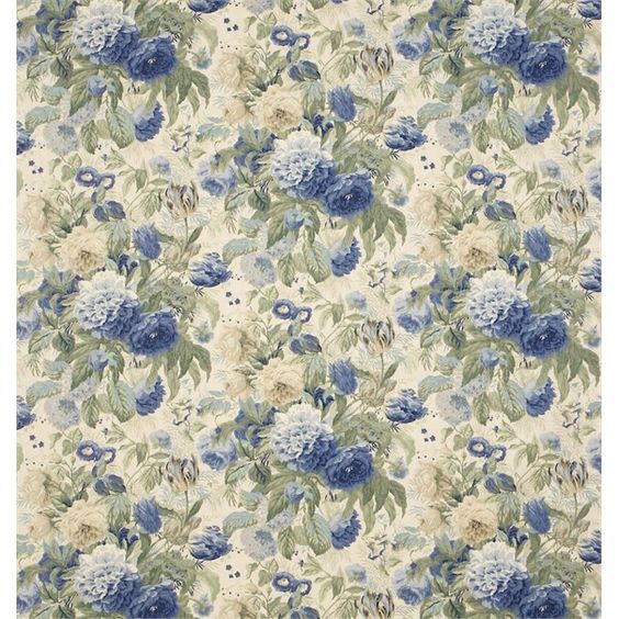
All weekend I burned with love for this cabbage rose fabric from Sanderson, called Devonshire Place. You never know from the online pictures - in person, the blue might look wrong, and the stone colour might be the wrong undertone for the paint we zeroed in on, and the scale might be bigger than my head - but it is cheery and bright and a cabbage rose. I love cabbage rose prints. They make me feel so happy and calm, I could look at them all day.
Looking at fabric usually makes me happy and calm too - or rather, jumpy-uppy-down excited because I love fabric so much - but it has been surprisingly difficult to find any fabric to work in our house. I guess if I can only have one or two prints, it's natural to be picky, but this is getting ridiculous.
Here's the deal: Ray is going to want to paint the house in a month or two. My dream is to have our house painted once, by professionals, before there's any furniture in it. Not now and again in two years when I'm sick of the colours. To achieve this longevity of satisfaction with our paint choices, I want them to coordinate with the fabrics we bought for love and perfection (and not for panic and proximity.)
Looking through the sample books at the upholstery store is a daunting task... and yet: they don't have everything there. I've found a few likely patterns online I couldn't see in person until the swatches came in a week or two after we ordered them. And as I might have mentioned, the prospects from last time all turned out to be awful, which is why I'm still looking. Cue the Time Crunch.
Thank goodness the house is taking as long as it is, huh?
And now, I will tell you today's story.
On Friday, I borrowed the fabric sample book for the upholstery I'd picked for recovering the old sofa we still love but have no space for, except in our bedroom. It's just simpler if everything starts from that, right?
It's a nice soft fabric in a herringbone weave - a mix of cotton and linen and manmade fibers to make it strong enough for heavy use, and astonishingly, it's within our budget. I'd chosen a neutral that turns out to be the colour of unbleached linen.

This bleh shade is not terrible in itself because we wanted a pretty inoffensive, flexible, low-contrast room this time - see "No More Paint For Me" policy described above - and Pete liked it too. Then I noticed that the same fabric is good for drapes so I said, I haven't been able to find a single floral fabric I like yet; why not have our drapes custom made in the same plain thing? and Pete said, Great!
We found a paint colour that matches it, thanks to the huge paint boards I bought from Maria Killam. These things are not cheap. When I took her colour course I met many budget savvy professional interior designers in a position to make good use of them who had not bought even one set, let alone the two I did. (That changed after they saw them in action during the course.) But WHAT a time saver they are. We are really hoping to choose only two, or maybe three paint colours for the whole house to simplify leftover paint storage, but you go through a lot of options before you can narrow that down. In the course, I also received a Benjamin Moore fan deck and that's been helpful too.
There's the good news. The bad news? The paint that matches our bedroom sofa fabric is called Cedar Key, and it's beige. Designers call it 'greige' because it's a mix of grey and beige but for my purposes, it's beige.

I should have seen this coming. Every picture I warm to when I look at inspiration images for the house have beige walls, or else some version of very dark grey - how could I miss that? Plus, I just wrote a whole blog post the other day about all the pale colours that are making me breathe more slowly and calmly.
And yet I love colour. I grew up in a house that was all beige and brown all the time apart from the turquoise walls in the dining room, and later the avocado banquette (left over from our second home's previous owners and never reupholstered.) I feel like I've done my time on beige.
Okay, so we could choose a contrasting pale colour and not need to match the sofa and curtains. I could pick a blue or green or purple if I wanted; I'm sure there's one that would look lovely. But that would mean even more time spent choosing paint.

Can you say, AIIIEEEEEEE. Plus I wouldn't get that layered tone on tone look I'm going for.
Thankfully I found a lighter, more ethereal shade that doesn't exactly match the fabric but is still friendly with it. It's called Pale Oak and naturally, it's also kinda beige. Sorry - greige.

It was at about this point that I panicked and ran to Lynn for reassurance, and got it. Also I spotted this peaceful bedroom at Laurel Home, with walls painted in Pale Oak, and that made me feel better too.

Yes, this looks like it could be a tiny shot of a hotel room, but that's kinda what I'm after - a room with just literal, not mental, baggage. The better to sleep in.
What I have to remember is what I decided at the beginning of all this nonsense - that the neutral is just the background. There will always be colourful knitting lying around, and we still have blankets and sofa cushions to choose, too. Which is where that gorgeous blue cabbage rose comes in. We were pretty sure it would work for cushions on the bedroom sofa, but Pete felt it would be too overwhelming as a print for the stairwell curtains.
Cue the doom music
This area is fabric problem number two. At the landing on the stairs from the main floor up to the bedrooms we have a stacked window which runs four feet wide and will require a covering a little short of thirteen feet tall, if you include the drop to floor level and room for a curtain rod at the top. And I do, because I can't really see cutting a curtain that big off at the knees, can you? It's probably better if it goes most of the way to the floor, or at least as close to the floor as necessary to balance the gap at the top.
A thirteen-foot curtain is going to have to be custom made by someone, and unless it's a plain fabric or a simple stripe, it has to be made by somebody other than me. I know my limits and matching a massive half-drop floral repeat is not within them!
That said, I don't want something plain or even stripey for that window - I want something we are excited to look at. This has turned out to be the only place in the whole house where I can have a spectacular fabric (except maybe the laundry room and there are no guarantees there either) and I don't want to give up on that dream till I have to.
It turns out there is another complication. Even though we are not fancy people, the fabric that goes into the stairwell is going to have to play nicely with the very fancy wall sconces that face the landing on the walls that frame the window, and which I found at a massive discount or I would never even have let myself aspire to them. Forgive me if you've seen this before:

It probably doesn't look too crazy on the screen but, um, this fixture is 17" tall. It's in scale for what is basically a massive air shaft, but having a pair of them is a pretty big statement.
That's a black metal strip at the top and bottom of the glass cover, and the ceiling fan at the top of the shaft, and the railing, and the custom curtain rod will all be black too, so having some reference to gold and/or black in the drapery fabric would be good.
HA. Like I can pick and choose.
I've gone through every UK fabric designer I can find, plus Waverly, Ralph Lauren, and all the other standard American companies on the hunt for something that's right for us, drawing the line only at Lee Jofa because we do not have many hundreds of budget dollars to spend on just one yard of fabric, let alone ten yards.
Although if I was going to go with Lee Jofa, I'm sure I could find a way to live with something like Ashridge Print:

But I say No to Lee Jofa. Instead, here are the fabrics I found that made it as far as me showing Pete.
'Ottoline' from Sanderson, features both copper and teal. I like it but I feel like the drawing style for the flowers is a bit 1960s, and Pete was a bit iffy about it too.

Sweet Bay, also from Sanderson, in Ebony/Ivory, is lovely but has an awful lot of green in it. The rest of the house is more blues and caramels and red.

This fabric is listed as being sort of polished, which put me off because I don't want a sheen but - spoiler alert! - I actually saw a different colourway of it today at the upholstery store, and the sheen is minimal. So is the pleasantness of the way it feels in your hand (and it turns out the flowers are indeed the size of my head.)
Angela Floral in cream, from Ralph Lauren, comes very close to fitting the bill in terms of colour and print, though it's more weathered than I had in mind:

I asked for a sample today anyway and am crossing my fingers. Maybe it will turn out to be the floral I dreamed of for our bedroom and couldn't find.
All of these fabrics are 54" wide, and to cover a 48" window two and a half times without a contrasting band of some sort, we need something that is 60" wide. That's really, really hard to come by, so I was inclined to look kindly upon the only contender I found in that category.
This baby is 61", but it looks more than a bit like the wallpaper you'd see behind the misery-stricken heroine of a 1930s movie drama:

It's another Ralph Lauren - Vintage Ashfield - and in spite of the association I really like its simplicity. There are other colours in this print that look less like old film, but they aren't quite right either. The whites look like true white instead of the off white I need, and the taupey version looks like it would make our honey maple floors very very unhappy. At least pewter gives a contrast and blends with all the black?
On a second pass of all the likely fabric manufacturers I found this print, which I'd rejected at first because the background is SO blue.

But I smiled when I saw it first, and I smiled again the second time and decided to show Pete, who smiled too. So I asked for a sample and am crossing my fingers harder than is strictly comfortable. It's another Ralph Lauren (Garden Harbor) and Ralph does not charge Lee Jofa prices. Or even Sanderson prices.
While I was looking through the Sanderson books today I was able to see Devonshire Place, the fabric pictured at the top of this post, and it is - well, I say this with apologies to anybody who reads this and has decorated much of their home with it, but frankly I found it hideous. The fabric is not a luxuriously woven linen or cotton linen blend, it's more of a figured weave with a texture pattern running under what is already a pretty busy print. So it's not for us.
Then I noticed a washed-out, dreamy linen with faded cabbage roses in front of a tiny-petaled bloom and was seriously smitten. The flowers were smaller than the palm of my hand, the colours were soothing, and I thought: bedroom? Clearly I don't love love love the faux-unbleached-linen of our sofa upholstery for curtains. But alas, the background of that fabric is a yellow beige and looked deeply horrible with the sofa upholstery we picked. And every other shade of the sofa upholstery, in fact, except the yellow beige one, which I do not love. So, no to those cabbage roses. I'm not even going to show you a picture of that print because I am still sad about it.
But after that? I flipped the page to this crazy bird print:

It's 'Swallows' (from Sanderson, of course) and it's a vintage design from the 1930s, which makes it perfect for the original age of our house, pre-facelift. I love these birds, and love that the colours that pick out their details match the two paint colours we shortlisted for the bedroom sofa, and especially love the idea of birds flying against a blue sky on either side of our ridiculously tall stack of windows.
But - there's nothing in this print to make our fancy gold sconces feel welcome on the landing. When I got home I did some more hunting and found this bird print on the Sanderson site - Finches.

This time I am beyond smitten. The colours are right for the house, right down to the blue, and the print includes branches. I love branches, a fun fact about me that you may have noticed if you read enough Hugs to see all the pictures I post of branches in the winter.
In fact, I think this print, in these colours, would look lovely and appropriate in every season - except maybe the fall?
If you look closely you can see that the birds and branches are not totally lifelike, as you would expect from a botanical print. They are more like something Edward Gorey would draw. And this is another huge draw for me because all my favourite books as a kid were illustrated by Edward Gorey. This fabric is so perfect for us.
But... I need ten yards, and it's pretty pricey fabric for that kind of volume. Not Lee Jofa pricing, but definitely not Laura Ashley pricing, and for a girl that has always been Laura Ashley On Clearance pricing - and even then, only for truly special situations - it's a little bit heart-attack-inducing to think of buying Finches for reals. So I'm still looking. (I'm totally asking for a sample of this one next time I go into the store, though, because perfect is perfect. And maybe it won't be perfect and I won't live the rest of my life wondering What If.)
We've since found another couple of possibilities but really I think this is enough for the first part of The Great Fabric Dilemma. If you've read all this way down I would like to apologize for dumping my convoluted thought processes regarding what is clearly a first world problem all over your screen. And I will leave you with a question:
Do you ever agonize this much over YARN??
Yeesh, like we needed another example of why knitting is tops...
No comments:
Post a Comment