Showing posts with label decorating. Show all posts

Saturday, December 2, 2023

The tree is up

Last year I was overwhelmed in the run-up to Christmas and it felt like one more chore to do. This year: BRING IT. I am so ready for the break, and I am all about the nostalgia.


This is a mini mitt I made in a class on twined knitting. I think I made a full-sized pair to give away, but that might be dreaming on my part because we all know what a selfish knitter I am, making things mostly for my own use because I can't bear to part with whatever it is. 

The thing about twined knitting is that you have to twist two strands of yarn around each other with every stitch. The natural and comfortable direction in which do this, for me, is the same direction in which yarn is plied, which results in impossibly twisted-up balls of feeder yarn you have to constantly stop and address. The solution to this problem is to spin your own yarn, then ply it in the opposite direction such that twining is simple and straightforward. 

So, yeah. If I take up twined knitting again, it means taking up spinning again, and that honestly is not a bad outcome for me if I can just clear enough of my calendar. I loved both those things a lot. 

Another thing I loved back in the day: Magic Cookie Bars. And I made some last night, for the first time since I was a teen, probably.


In my shift away from processed foods I forgot how completely decadent and delicious these things are. Just the aroma coming off the pot where I melted butter and then stirred graham cracker crumbs into it was Wow. And once you have that pressed neatly into a pan, you pour sweetened condensed milk over, then top that with chocolate chips and coconut? I mean... how can you not eat the whole thing? Thankfully you can freeze the squares and they keep for three months, so there is some reprieve from overdoing the sugar load.

One of my big jobs for 2023, apart from organizing a tiny home (which was not on the agenda in January when I developed this year's life goals) was decluttering our house. Technically I started that job in November but there are so many cupboards and cubbyholes to address I clearly needed the extra time. I'm STILL not done! But this week, going through a junk drawer, I found two more of the precious felted wool Christmas pins I made years ago. 


I loved these too and now that the tree is up and I have Official Festive Lighting, I am going to reexamine some decluttered craft nooks and see if I can't find the gear for these projects. I know I have more tiny bells and felt pieces and embroidery thread somewhere. 

If you'd like to give them a go with your own scraps and backing pins, my mini tutorial is here

One thing that isn't nostalgic here is this year's wreath, a departure from our usual plain green boxwood over the living room fireplace mantel:


The florist didn't have our usual size in anything but this version with glossy red faux berries, so we agreed to be spontaneous and break tradition. Normally the wreath lives on the wall all year, fading to sage for Easter and gold for Canadian Thanksgiving (October) before being renewed in December. Not sure how the red berries will play for all that, but they're only wired on, so if I get to it fast enough in January before the boxwood is too dry and brittle, I might be able to remove them.

I should just be sure not to indulge in too many sweets first because I will need a steady hand, heh.


I hope your holiday plans are coming along nicely and feel more like an indulgence than a responsibility. Pretty sure we could all use whatever break we can manage. Thanks again for spending this time with me, and I'll see you here next Saturday!


Saturday, November 25, 2023

Office Party

As promised, pictures of my completed IKEA build from last Saturday! Here's the view from my office door, looking at the work area as opposed to the Zoom Background area I showed a few weeks ago.

Side note before we talk IKEA: the lighting! There is a ridiculous amount in this room. Three bulbs in the ceiling, two serious wall sconces, the matching table lamp, and now a second table lamp. The room is only 5.5' x 8.5' - you can see the corner of my IKEA standing desk on the right, to give you an idea of how small it really is - but I had hoped to sew in here and do other crafty things, so when we were renovating we had it majorly wired. And you know what? I really do use all these lights at different times. It was totally worth it.

The new addition is a Hemnes shelf unit - intended really for a bathroom but perfect for my office needs.


To the left of it I have a Hemnes bookcase (not pictured because you can only contort so much in a doorway.) I really wanted a second one for symmetry but it was too tall for the wall sconce I have no intention of taking down. I was sad about that, because the solid sides make it easier to hide clutter from my work area. 

As it turns out though, the open structure has its own perks. Specifically, access from the sides. I hadn't planned this but once the unit was in place I realized I could have a designated planner area and get my gel pens and markers off the desk entirely.

Bonus: I finally have a place to display the Group of Seven and David Milne prints I was gifted last year and love to look at. Probably I should get around to taking them out of their plastic wrap but in the meantime, they do a great job of inspiring me while hiding messy things I need to get at every so often. Because let's be honest. The two white bins I bought for this purpose were not enough for that job!

Another innovation I had with this makeover was my 'whiteboard'. A lot of writers will use a wall as planning space, sticking up Post-It notes to work out scenes and make sure their narrative arcs work well. I didn't have wall space for that when I was working in our front window, but in the office I have these two sconces... and in the basement, a long piece of leftover baseboard trim already primed white. 


It only took about half an hour to put them together with some bristolboard, washi tape, and blue and white scrapbooking string. No holes in the wall either. I just set the baseboard trim over the sconce plates and I was done. I'll probably start using it next week, when I dig into the second draft of my most recent project.

The desks are unstained rubberwood, sourced from Wayfair, and they are so great. The primary one is four feet wide, which feels generous in such a small space, and 18" deep. The one running under the window is just 16" deep, but it's five feet wide which allows me to have the table lamp plus loads of space for spreading out pages and notes when I'm reviewing a printed manuscript. I sure didn't have that luxury in the dining room, unless I took everything off my desk and shoved it onto the dining table.

I'm still not quite there with this office. I'd like to get rid of more cluttery bits from the boxes, for one thing, and streamline my art supplies, for another. But I'm enjoying the space and grateful for it.

Overseeing it all, and guarding the boxes with my notes and pages for other projects, is my wooden monkey:

He was a gift from my older brother, who died when I was a teenager - he was great at gifts and I still treasure the things he chose for me. I was probably eight or ten when he picked up this little guy. His curved hands and feet mean he can hang off things and it's fun to pose him!

Okay the sun is shining and it's time for us to get on with our days, so I will leave you with this picture of how cosy and cute my planner area looks at night.

Thanks again for spending this time with me and I'll see you next Saturday!


Wednesday, January 17, 2018

Installing a very important shelf

This is a super exciting achievement disguised as the most boring Hug post EVER.  Lookit!


I hung up a shelf without help!

You might have seen this before because I did the job last fall and may have shown you office pictures since.  But today I want to take the time to tell you what an amazing accomplishment it was for me to get a shelf on the wall.

Because it is not just any shelf: it is the ugliest shelf in my stash of small vintage kitchen or bathroom shelves.

For some reason I love these one-off things, and have been collecting them since we first bought our house to stick on a wall someplace.  But this particular one never worked out in the house pre-renovation.  Too plain, I think, or too wide, and definitely too tippy at the bottom to stand freely on a counter.

I bought it at a junk shop years and years ago, mainly because it was solid and because I'm always attracted to the idea of a shelf that does double duty as a towel bar, even though I never end up installing those near a sink.

Then, for reasons I don't recall, I painted it a sickly pale yellow... surely the original colour must have been less awful?  Or maybe it was just incredibly dirty and peeling and needed to be painted something, and the pale yellow was all I had (but why I would have had that colour at all... shudder.)

It had two hooks on the back so once it was dry I strung some picture wire between them and slung it over a nail in our junky storage room (now a cute laundry room with a heap of junky storage in it) and thought - hmmmm.

It was pitiful.  We kept spare light bulbs on it and I was always worried they would fall off and break because the shelf was so sad.

When we renovated the house I had bigger ideas, especially once I noticed this particular shelf was almost as wide as the table at the end of my desk where my sewing machine lives, and appreciated its clean lines as an asset rather than a bore.

First, I painted it (and two other shelves) the same colour as the walls in the office - Farrow and Ball's Clunch.


Then I pretended it didn't exist for a really long time because I didn't want to ask Ray to help me hang it and I didn't know how to do it myself so that it would function a little better than it had with the picture wire.

Then I took another look at the back and saw it had, in addition to the hooks, two little recesses to slip over the head of a screw.

Aha! I thought.

And then, NOOOOOO

because that's two screws, not one, and they have to be level and perfectly positioned to match what's on the back of the shelf.  And I didn't have a drill handy and Pete was out so I couldn't ask him where the drill is and anyway, did I really want to use a drill on my office wall?

Of course I didn't.

So I got onto YouTube and found that a very nice young man had posted a helpful video that demonstrates, essentially, how to put an anchor and a screw into drywall without a drill (spoiler alert: you mark the spot and ram through it with a screwdriver.)

And then I measured super carefully.  And used the level that Les gave me lo these many years ago.  I know, I know, the picture isn't straight, but the shelf is.


There you go!  That's me, turning clutter into something useful!


Even with the bad preliminary staging I was and still am ridiculously proud of myself about it, can you tell?


Yeah, in case you were wondering after the pic at the top of this post, I put an old spice rack on the top.  I have been collecting shabby old editions of those over the years too and painting them to match the walls they'll go on, but I ran out of steam with this one and suddenly thought:

WHY NOT DISTRESS IT WORSE, INSTEAD??

sorry for the shoutiness, but that's how loud the thought was.

A little affection from some sandpaper and it was good to go... I am totally remembering that trick next time I notice something that needs refinishing.


Now of course I need to fuss more with what goes onto the shelf.  I mean the vintage linens are nice, and I appreciate having a designated space for the bunny who goes with me on planes and to the dentist, but I'm not sure this is its best use.  Do I focus on sewing aids, inspirational items, colour staging, or just plain storage?  It's on the wall firmly enough to take weight, I can tell you that much, but it's a little shallow even for paperback books.  Hmmmm.


Monday, January 15, 2018

Artful mirrors

All my life I've hung artwork on bare walls and now I'm wondering, did I miss something?  Because WOW, the difference a mirror makes!


Just look at all that glow coming off the mirror in our dining room.  It's reflected from our Christmas tree, but when I finally get around to taking down said tree...


(WOW again, the difference an artificial tree makes on holiday stress levels and scheduling) I will move our floor lamp back to its spot and maybe we will still have a glow.

This shapely mirror is on a wall that faces, but is not directly opposite, a second mirror I do not seem to have a proper picture of. Here is the frame, at least, taken from one of its many journeys around the house looking for a wall that would use it to best advantage:


Both mirrors are framed with the same colour - a sort of warm metallic hue that matches polished nickel bathroom fixtures perfectly.  Online they were listed as 'silver' so I bought them to go in two bathrooms but... our fixtures are chrome, and no matter how long I tried to pretend otherwise, the difference between polished nickel and chrome is MARKED.  Completely dissimilar animals.  I can promise you it's true because Restoration Hardware shipped me a few things in polished nickel by accident and I just handed the boxes to Ray without checking.  So, now we have a polished nickel faucet and chrome everything else in the master bath.  (too late to exchange now, as the faucet's been discontinued, so we are living with it.)

So: Both the same colour but different materials (one distressed metal, one wood) and shapes (one looks like a crest, the other is a plain ol' rectangle with beading.)

And they look fantastic together.  One is opposite the window and reflects daylight back into the room at one end of the day; and the other contributes either lamplight or daylight from the other end of the horizon.

Both also reflect the ceiling light in the dining room and that is less of a success because I bought two chandeliers to hang over our long narrow dining table.  You are crafty so I know you know why: you need bright light for cutting fabric and knitting with friends and doing meticulous needlework!  and what else is a dining table for anyway?  But it is kind of overkill and technically, I should do something about it.

I could get a dimmer on the chandeliers.  I could also put in 40-watt bulbs.  I admit it was a little crazy, the desperation of a person who has gone years without ceiling lights, to buy 60 watt bulbs for two fixtures with six faux candelsticks each.  Pete was squinting when I tested this out the other day, and he's the one who wanted bright lighting everywhere.  Still!  When the curtains are open and we have natural light, we don't need the chandeliers.  And when we are actually dining and want softer lighting, the piano mirror can reflect back the light from the sconce lamp there, and we can supplement with candles.

Digression:

I've been seeing artfully melted faux pillar candles with waving faux flames triggered by LED lights that work on a timer.  I am SO into this concept.  A trio of them near the bathtub would make such a soothing soak after snow shoveling don't you think?  And also, obviously, another trio would be an asset during an elegant meal in a dining room when placed on a mantelpiece or ranged down the middle of the table, with no wax to clean off the tablecloth later.

Back to my point: our dining room was nice enough once the furniture was in and the drapes hung, but after the mirrors went up it was a space I want to be in. 

I put a chair into the front hall to help with boots going on or coming off, and now I find myself drifting there to sit with the phone during a chat, or to catch up on the news, because when I look up I will be looking into that dining room.

I find myself obsessing about treating it as a conservatory full of plants.  Me! Who can't grow anything!

And all because of a pair of semi matching mirrors I should really have returned to the store but didn't, as I am far too lazy. 

(Or do I mean, brilliant and resourceful?)

Mirrors, people.  They are amazing.

Also we finally chose mirrors for the two bathrooms that have been mirror free this whole time, and they actually got installed. I LOVE THEM.  and they were the cheapest things we bought for the whole house.  I think I paid more for wastebaskets.  Which means I overpaid for the wastebaskets, obviously, but let's focus on the mirrors instead.


Ray says they will be okay as long as we don't expose them to steam.  Good thing he put a serious ceiling fan into the master bath, huh?  There's a shower in there.


(isn't it marvelous how there is absolutely no difference between the taps in here and the tissue box cover? I should look at this bathroom through my phone camera every day.)

(probably if I got rid of the tissue box cover I really wouldn't notice.  but I soooo love that thing.)

(have a great day, and I'll see you tomorrow - really!)


Tuesday, December 13, 2016

Merry Christmas from a flying sheep

What do you think of my improvised sheep with holly-leaf wings?


Pete came home and saw it and kind of shrieked, "Aghhhh! Bat-Sheep!" but once I explained, he was totally supportive of my artistic vision.  I mean REALLY, bat wings? They aren't even black.  Or green, because I don't have green construction paper on hand, and red was going to be too gory, and there were already blue snowflakes on this particular stretch of wall because white ones wouldn't stand out enough against the white walls.  See?  I'm completely logical, like always.

(design note: the wings are paper, stuck to the wall, and the sheep is suspended in front of them on a string from a temporarily placed hook.  this combination is surprisingly effective in real life in spite of being the product of about three minutes' effort.)

As I was saying the other day to a sympathetic friend, there is no time in my life so busy and complicated and stressful that I can't find a way to make it more so, and in this case, that way is "Turn The Condo Into A 3-D Advent Calendar."

Yes, it's true.  For the last two weeks I have been either planning for, or doing, three things here in CondoLand.  Every single day.  A number gets stuck to the wall (see, I'm all the way up to 12 as of yesterday)...


and a decoration goes up or out...


(this is two, actually - the garland was hung one day last week and the snowman is from yesterday)

and I put new candy in a bowl for anybody who finds the newest decoration. 


Today's offering is chocolate-orange Lindor balls and I might be eating one as I type this  (after all, I am doing most of the work, right?)

The candy part probably strikes you as a bit silly because after all, who's going to miss a flying blue-winged sheep on the wall?  But some of the decorations have been more subtle, like when I tucked a salt and pepper shaker set under the paws of two different bunnies on the table beside the TV.  Okay that just sounds obscure - I should clarify: the salt and pepper shakers are designed to look like wrapped Christmas presents.  Anyway since there are rather a lot of bunnies scattered here and there, it took quite a while before anybody spotted that, and it was even longer for the bottle-brush miniature trees I stood under the wooden 'Happy Holidays' sign I'd tacked up on the backboard of our bookcase on the first day.

The miniature tree was a no-brainer for all who sought it, but I very cleverly set two parts of a toy train under it for ambiance and then a few days later when the tree had become part of the furniture, I sat two little Santas on top of each train, and they were hard to see.  

Overall, this scheme is working out well.  it's fun to see the place slowly transitioning from a fast-paced autumn to a frenetic Christmas. 

On the downside, I keep forgetting that I have committed to do this every day.  It is surprisingly difficult to think of fun decorations, especially under pressure!  Plus, if I were trying to do something new-to-us every day it would get very expensive.  Instead I am bringing in some new things, like the bird garland; repurposing some things we had before, like the sheep, the mini tree, and the Santas; and making some things myself.  The blue snowflakes, for example, were born of desperation when all I had handy was the blue paper and some sticky-tack stuff to get them onto the wall and about five minutes' grace.  The biggest expense? Command-brand hooks to attach to the walls temporarily for suspending garlands and other random decorations.

I have no idea what I'm doing today.  I really need to figure that out, and soon.

For his part, Pete is contributing to the jollity which a much easier project that is just as satisfying, not that I'm jealous or anything.  We have this little stuffed fox toy we call 'Finlay', and Pete has taken to moving it around the room periodically, sort of like our personal Elf On The Shelf.  Finlay doesn't do anything terribly remarkable but he does turn up on some interesting perches.  I don't know if I will commit to the 3-D Advent Calendar thing again but I have a feeling that Finlay is going to be pulling this stunt for a looooong time.

In other Christmas news, remember how I bought two sets of dishes for the new house because I couldn't choose just one?  Well, now we have three.


It's just - I've always wanted Christmas dishes and these ones were really affordable, and made by Royal Stafford, whose plates I love because they have this super glossy finish that just feels marvelous coming out of the cupboard or getting put away from the dishwasher.  Hey, at least I restricted myself to an 8-place setting this time!

Since I got them at the discount-housewares marvel we call HomeSense (is that what it's called in the US too?) I had to take what was available, so I got the bowls and sandwich plates with the sleepy snowy village print and the dinner plates with the fireplace:


And then a few days later I went to a different HomeSense and they had four dinner plates with the snow-village so I bought those too.  Sigh... I have about as much self-restraint as you can fit into a gnat, but I guess that's okay this time at least, because we are LOVING eating off these dishes.  It really does make each day a little more special.


As interesting as all this is, I am pretty sure that what you are wondering most is, Where is the fingerless mitt pattern?? and I'm with you.  I have the mitts, I have the math, and I have the motivation.  But I still don't have the pattern.  Or photos, which is the trickiest part, since I would need three hands, one of them mitt-less, to produce them.  I will try to get that part done tonight but oh dear, if I am able to publish the pattern by Saturday morning I will be a happy knitter.  My apologies!

Perhaps this other winged sheep will serve as consolation:


Have a wonderful day and I'll see you soon!


Friday, October 7, 2016

DIY paint sample boards

If you do any research on how to pick paint colours, you'll learn very quickly how important it is to look at your choices on part of a wall you want to cover before you commit to the whole room.  But why paint a wall when you can paint something more portable and less permanent?


This is an incredibly useful trick I learned from reading Maria Killam's blog, and buying her paint board sample packs for the most-used colours from Benjamin Moore.  Maria's boards are large pieces of card stock, customized with actual paint and labeled with the colour, the number, and its undertone.  These sets gave me a lot of confidence and a few of them were in constant use here until we decided to go with Farrow and Ball paints instead.


(Farrow and Ball paints don't have any odor, and the colours are beyond amazing in every light, and though they cost a little more than the Aura paint we planned to use, each can goes a little farther than a can of Aura, too.)

The thing about paint - especially Farrow and Ball paint, which has more pigments than most - is that one choice can look like any of several different colours depending on the foliage outside the window, the amount of natural and/or artificial light, the direction the room faces, and so on.  Also: paint swatches from the store aren't a reliable predictor.  Even opening the can and looking inside won't help you because paint dries darker than it looks when wet.

But if you paint boards - large boards that let you see how the colour looks over a serious chunk of space - it's a lot easier to determine which paint will make your curtain fabric or upholstery look its best.

Here we have Door Number One:


And now Door Number Two:


Maybe your computer won't show you what I see, but it's a no brainer in person that the first colour is the only option.  And yet they both looked so perfect for this fabric when I was working from tiny chips.

At the Farrow and Ball store here in Toronto, there is a window display of samples painted on inexpensive canvases from the dollar store.  I hadn't even considered this possibility and I think it's genius.  The card stock boards Maria offers are very practical for interior designers who are carting entire collections to different clients' homes, but if you only need a few samples, canvases are a great option.  They aren't that expensive, they're easy to paint over, you can choose the exact size you want, and when you're carrying just two or three of them they won't bend in your bag.

Because the little sample pots from Farrow and Ball cover quite a lot of ground, I painted some larger canvases for serious decision making and some smaller ones, all in the same colours, to keep in my purse for emergencies and fabric shopping trips.


They fit right into a little bag I stitched together a few years ago to hold small knitting projects and are so easy to use.

Thanks to my sample boards I didn't have to wait until the drywall was taped and primed to see what our favourite paint options look like in different rooms of the house.  Which is ideal, because Farrow and Ball specifies different undercoats depending on the type of colour you're choosing (red, light, medium, dark, etc.) and we've been on the fence about what colours to use in which rooms on the main floor.


I mean sure, that particular blue is a perfect match for the blues in the painting I want to hang over one of the fireplaces, and pairing the two would be pretty spectacular....


But do we really want the drama of a dark teal blue room?  (yes)
Do we want walls that will match our velvet sofa perfectly? (are you kidding me yes)
Are we confident we won't regret painting such a dark colour in an already sort of dark room? (nope)

These questions matter, because if we choose Stiffkey Blue for the living room, it will need the dark colour undercoat.  If we put it into the dining room instead, then it will need that undercoat.  And what about the powder room, where I really wanted something kind of dramatic?  The painter is totally going to want to know before he gets started.  In fact I need to know, because I'm the one who's ordering the paint, and how else can I order the right amount of each type?

There's another consideration when it comes to sample boards and that is: omigosh is it ever relaxing to paint canvases with Farrow and Ball paint.


I couldn't stop.  I went back to the store four times to buy more sample pots.  I have never worked with paint so pleasant to use, or that rinsed out of the brush so perfectly - it was just so, so nice to make these boards.  I got paint on my fingers and it washed off quickly with nothing more than some water.  The minerals they use to make this stuff make an enormous, and welcome, change from acrylic paint!

In the end we settled on a pretty simple palette that will repeat through the whole house:


We're going to use the lightest of our favourite colours, Clunch, in almost every room and hallway.  In some parts of the house it looks pale green, in others creamy yellow, and in still others a pale grey-white, but it's always gorgeous.  This will sound lame but a few months ago I was reading a British decorating magazine and stopped to admire the beautiful period home of a woman who rooms were "painted throughout in Clunch."  I mean I have even remembered that wording all this time afterward, and the feeling I had as I thought Oh I wish I could do that, certain it would not be possible because the cost would be so far out line with common sense.  I'm so grateful I happened to be walking by the Farrow and Ball store after a morning in the Sanderson fabric showroom or I would never have known it was within reach after all.

In the front hall and dining room and powder room we will use Elephant's Breath, which is sometimes a flat cold grey, sometimes a greyed lavender, and sometimes taupe or even light beige.  I'm a little nervous about this one because grey is on its way out after many years of saturating the design market, but it's the perfect complement to the black floor tiles going into the front hall and main floor bathroom... and I can repaint those three rooms myself if I really have to, because there is so little painted wall to be found in them.  Sometimes you just have to ignore trends and choose what's right for your own situation.

One bedroom will be Rectory Red, my favourite shade of blue-red and a natural extension of the reds in other rooms' fabrics and accents.  We had a red bedroom in the old version of our house and even though that is supposed to be one of the worst colours for inducing and maintaining sleep, I always found that room to be warm and comforting.  And anyway: so important to us to carry over aspects of the original house, as we did with our wood flooring.

The wildcard is Stiffkey Blue, which I'll paint into the enclosed gap over the dining room fireplace if Elephant's Breath is too horrible with our painting and we don't have another obvious choice of art to hang there.  If we do that, I'll have extra, so I might use it to paint my desk... and probably some random picture frames... and maybe a few wall shelves.  I have so many of those that I've picked up at different flea markets, and they look so great just hanging on random walls or standing at the back of a counter.

I might even use up the rest of the sample pots to make some custom art out of the canvases, when I don't need them for decision making any more.  Why not, right?  I mean anything that justifies using this paint in a meditative way has good to be a good idea... it may not be knitting, but it sure is a comfort!


Monday, September 12, 2016

The great fabric hunt - part one

This past weekend, I focused on knocking down as many house decisions as possible.  I want to clear the slate so I can focus on the back yard plan and, you know, work... and maybe some knitting, so I have a new hat before winter settles in.  Apart from laundry room choices, this has meant choosing fabric! at last, something fun.  And yet... not.


 I think we need to start this post with something gorgeous.

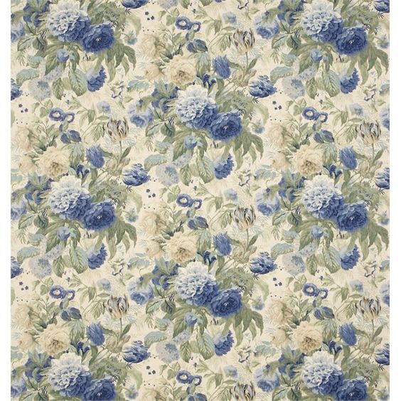
All weekend I burned with love for this cabbage rose fabric from Sanderson, called Devonshire Place.  You never know from the online pictures - in person, the blue might look wrong, and the stone colour might be the wrong undertone for the paint we zeroed in on, and the scale might be bigger than my head - but it is cheery and bright and a cabbage rose.  I love cabbage rose prints.  They make me feel so happy and calm, I could look at them all day.

Looking at fabric usually makes me happy and calm too - or rather, jumpy-uppy-down excited because I love fabric so much - but it has been surprisingly difficult to find any fabric to work in our house.  I guess if I can only have one or two prints, it's natural to be picky, but this is getting ridiculous.

Here's the deal: Ray is going to want to paint the house in a month or two.  My dream is to have our house painted once, by professionals, before there's any furniture in it.  Not now and again in two years when I'm sick of the colours.  To achieve this longevity of satisfaction with our paint choices, I want them to coordinate with the fabrics we bought for love and perfection (and not for panic and proximity.)

Looking through the sample books at the upholstery store is a daunting task... and yet: they don't have everything there.  I've found a few likely patterns online I couldn't see in person until the swatches came in a week or two after we ordered them.  And as I might have mentioned, the prospects from last time all turned out to be awful, which is why I'm still looking. Cue the Time Crunch.

Thank goodness the house is taking as long as it is, huh?

And now, I will tell you today's story.

On Friday, I borrowed the fabric sample book for the upholstery I'd picked for recovering the old sofa we still love but have no space for, except in our bedroom.  It's just simpler if everything starts from that, right?

It's a nice soft fabric in a herringbone weave - a mix of cotton and linen and manmade fibers to make it strong enough for heavy use, and astonishingly, it's within our budget.  I'd chosen a neutral that turns out to be the colour of unbleached linen.


This bleh shade is not terrible in itself because we wanted a pretty inoffensive, flexible, low-contrast room this time - see "No More Paint For Me" policy described above - and Pete liked it too.  Then I noticed that the same fabric is good for drapes so I said, I haven't been able to find a single floral fabric I like yet; why not have our drapes custom made in the same plain thing? and Pete said, Great!

We found a paint colour that matches it, thanks to the huge paint boards I bought from Maria Killam.  These things are not cheap.  When I took her colour course I met many budget savvy professional interior designers in a position to make good use of them who had not bought even one set, let alone the two I did.  (That changed after they saw them in action during the course.)  But WHAT a time saver they are.  We are really hoping to choose only two, or maybe three paint colours for the whole house to simplify leftover paint storage, but you go through a lot of options before you can narrow that down.  In the course, I also received a Benjamin Moore fan deck and that's been helpful too.

There's the good news.  The bad news? The paint that matches our bedroom sofa fabric is called Cedar Key, and it's beige.  Designers call it 'greige' because it's a mix of grey and beige but for my purposes, it's beige.


I should have seen this coming.  Every picture I warm to when I look at inspiration images for the house have beige walls, or else some version of very dark grey - how could I miss that?  Plus, I just wrote a whole blog post the other day about all the pale colours that are making me breathe more slowly and calmly.

And yet I love colour.  I grew up in a house that was all beige and brown all the time apart from the turquoise walls in the dining room, and later the avocado banquette (left over from our second home's previous owners and never reupholstered.)  I feel like I've done my time on beige.

Okay, so we could choose a contrasting pale colour and not need to match the sofa and curtains. I could pick a blue or green or purple if I wanted; I'm sure there's one that would look lovely.  But that would mean even more time spent choosing paint.


Can you say, AIIIEEEEEEE.  Plus I wouldn't get that layered tone on tone look I'm going for.

Thankfully I found a lighter, more ethereal shade that doesn't exactly match the fabric but is still friendly with it.  It's called Pale Oak and naturally, it's also kinda beige.   Sorry - greige.


It was at about this point that I panicked and ran to Lynn for reassurance, and got it.  Also I spotted this peaceful bedroom at Laurel Home, with walls painted in Pale Oak, and that made me feel better too.


Yes, this looks like it could be a tiny shot of a hotel room, but that's kinda what I'm after - a room with just literal, not mental, baggage.  The better to sleep in.

What I have to remember is what I decided at the beginning of all this nonsense - that the neutral is just the background.  There will always be colourful knitting lying around, and we still have blankets and sofa cushions to choose, too.  Which is where that gorgeous blue cabbage rose comes in.  We were pretty sure it would work for cushions on the bedroom sofa, but Pete felt it would be too overwhelming as a print for the stairwell curtains.

Cue the doom music

This area is fabric problem number two.  At the landing on the stairs from the main floor up to the bedrooms we have a stacked window which runs four feet wide and will require a covering a little short of thirteen feet tall, if you include the drop to floor level and room for a curtain rod at the top.  And I do, because I can't really see cutting a curtain that big off at the knees, can you?  It's probably better if it goes most of the way to the floor, or at least as close to the floor as necessary to balance the gap at the top.

A thirteen-foot curtain is going to have to be custom made by someone, and unless it's a plain fabric or a simple stripe, it has to be made by somebody other than me.  I know my limits and matching a massive half-drop floral repeat is not within them!

That said, I don't want something plain or even stripey for that window - I want something we are excited to look at.  This has turned out to be the only place in the whole house where I can have a spectacular fabric (except maybe the laundry room and there are no guarantees there either) and I don't want to give up on that dream till I have to.

It turns out there is another complication.  Even though we are not fancy people, the fabric that goes into the stairwell is going to have to play nicely with the very fancy wall sconces that face the landing on the walls that frame the window, and which I found at a massive discount or I would never even have let myself aspire to them.  Forgive me if you've seen this before:


It probably doesn't look too crazy on the screen but, um, this fixture is 17" tall.  It's in scale for what is basically a massive air shaft, but having a pair of them is a pretty big statement.

That's a black metal strip at the top and bottom of the glass cover, and the ceiling fan at the top of the shaft, and the railing, and the custom curtain rod will all be black too, so having some reference to gold and/or black in the drapery fabric would be good.

HA.  Like I can pick and choose.

I've gone through every UK fabric designer I can find, plus Waverly, Ralph Lauren, and all the other standard American companies on the hunt for something that's right for us, drawing the line only at Lee Jofa because we do not have many hundreds of budget dollars to spend on just one yard of fabric, let alone ten yards.

Although if I was going to go with Lee Jofa, I'm sure I could find a way to live with something like Ashridge Print:


But I say No to Lee Jofa. Instead, here are the fabrics I found that made it as far as me showing Pete.

'Ottoline' from Sanderson, features both copper and teal.  I like it but I feel like the drawing style for the flowers is a bit 1960s, and Pete was a bit iffy about it too.


Sweet Bay, also from Sanderson, in Ebony/Ivory, is lovely but has an awful lot of green in it.  The rest of the house is more blues and caramels and red. 


This fabric is listed as being sort of polished, which put me off because I don't want a sheen but - spoiler alert! - I actually saw a different colourway of it today at the upholstery store, and the sheen is minimal.  So is the pleasantness of the way it feels in your hand (and it turns out the flowers are indeed the size of my head.)

Angela Floral in cream, from Ralph Lauren, comes very close to fitting the bill in terms of colour and print, though it's more weathered than I had in mind:


I asked for a sample today anyway and am crossing my fingers.  Maybe it will turn out to be the floral I dreamed of for our bedroom and couldn't find.

All of these fabrics are 54" wide, and to cover a 48" window two and a half times without a contrasting band of some sort, we need something that is 60" wide.  That's really, really hard to come by, so I was inclined to look kindly upon the only contender I found in that category.

This baby is 61", but it looks more than a bit like the wallpaper you'd see behind the misery-stricken heroine of a 1930s movie drama:


It's another Ralph Lauren - Vintage Ashfield - and in spite of the association I really like its simplicity.   There are other colours in this print that look less like old film, but they aren't quite right either.  The whites look like true white instead of the off white I need, and the taupey version looks like it would make our honey maple floors very very unhappy.  At least pewter gives a contrast and blends with all the black?

On a second pass of all the likely fabric manufacturers I found this print, which I'd rejected at first because the background is SO blue.


But I smiled when I saw it first, and I smiled again the second time and decided to show Pete, who smiled too.  So I asked for a sample and am crossing my fingers harder than is strictly comfortable.  It's another Ralph Lauren (Garden Harbor) and Ralph does not charge Lee Jofa prices.  Or even Sanderson prices.

While I was looking through the Sanderson books today I was able to see Devonshire Place, the fabric pictured at the top of this post, and it is - well, I say this with apologies to anybody who reads this and has decorated much of their home with it, but frankly I found it hideous.  The fabric is not a luxuriously woven linen or cotton linen blend, it's more of a figured weave with a texture pattern running under what is already a pretty busy print.  So it's not for us.

Then I noticed a washed-out, dreamy linen with faded cabbage roses in front of a tiny-petaled bloom and was seriously smitten.  The flowers were smaller than the palm of my hand, the colours were soothing, and I thought: bedroom?  Clearly I don't love love love the faux-unbleached-linen of our sofa upholstery for curtains.  But alas, the background of that fabric is a yellow beige and looked deeply horrible with the sofa upholstery we picked.  And every other shade of the sofa upholstery, in fact, except the yellow beige one, which I do not love.  So, no to those cabbage roses.  I'm not even going to show you a picture of that print because I am still sad about it.

But after that?  I flipped the page to this crazy bird print:


It's 'Swallows' (from Sanderson, of course) and it's a vintage design from the 1930s, which makes it perfect for the original age of our house, pre-facelift.  I love these birds, and love that the colours that pick out their details match the two paint colours we shortlisted for the bedroom sofa, and especially love the idea of birds flying against a blue sky on either side of our ridiculously tall stack of windows.

But - there's nothing in this print to make our fancy gold sconces feel welcome on the landing.  When I got home I did some more hunting and found this bird print on the Sanderson site - Finches.


This time I am beyond smitten.  The colours are right for the house, right down to the blue, and the print includes branches.  I love branches, a fun fact about me that you may have noticed if you read enough Hugs to see all the pictures I post of branches in the winter.

In fact, I think this print, in these colours, would look lovely and appropriate in every season - except maybe the fall?

If you look closely you can see that the birds and branches are not totally lifelike, as you would expect from a botanical print.  They are more like something Edward Gorey would draw.  And this is another huge draw for me because all my favourite books as a kid were illustrated by Edward Gorey.  This fabric is so perfect for us.

But... I need ten yards, and it's pretty pricey fabric for that kind of volume.  Not Lee Jofa pricing, but definitely not Laura Ashley pricing, and for a girl that has always been Laura Ashley On Clearance pricing - and even then, only for truly special situations - it's a little bit heart-attack-inducing to think of buying Finches for reals.  So I'm still looking.  (I'm totally asking for a sample of this one next time I go into the store, though, because perfect is perfect.  And maybe it won't be perfect and I won't live the rest of my life wondering What If.)

We've since found another couple of possibilities but really I think this is enough for the first part of The Great Fabric Dilemma. If you've read all this way down I would like to apologize for dumping my convoluted thought processes regarding what is clearly a first world problem all over your screen.  And I will leave you with a question:

Do you ever agonize this much over YARN??

Yeesh, like we needed another example of why knitting is tops...